Logos that Got it Right - 14 of the Oldest Company Logos Still Being Used Today
Scott Kalapos on Sep 16, 2021
Past and present come together as one in this post, as we're taking a look at some of the oldest logos in the world that are still in use today. Some are in their original form, some have some very minor tweaks, and others have seen periods of inactivity only to be revived again. The common bond between these (mostly) corporate logo designs is the fact that they've stood the test of time and achieved international fame for generations. There are 14 different logos that we'll examine today, all of which have managed to strike just the right chord to become institutions across the globe.
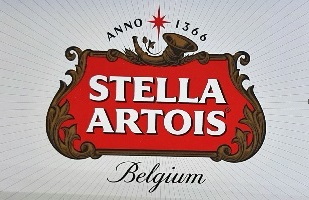
1. Stella Artois
We'll start things off by introducing the very oldest logo that you'll see in this article. Stella Artois is a world-famous pilsner beer. The version that we know today was first brewed in 1926. However, its origins date back to a brewery in Belgium that began operations in 1366. The name of this brewery was "Den Horn", which translates to "The Horns". The curved horn graphic that appears in the Stella Artois logo has been there ever since, pre-dating the name of the beer itself.
A series of mergers and acquisitions over the years saw several changes of hands and official owners of the beer and its brand name. However, it was in 1708 that Sebastian Artois brewery. In 1926, a special holiday version was released. This brew was called the Christmas Star and was met with immense popularity. This seasonal variety became the company's flagship beer, receiving the name Stella Artois, as "stella" translates to "star". The name still sits beneath the curved horns to this day. At the top, a star is depicted between the word ANNO (A.D., or the Year of the Lord) 1366, giving a nod to the company's rich history.
2. Shell Oil
Shell is one of the most famous petroleum companies in the world. It's unlikely that anyone reading this has never been to a Shell gas station or at least seen this logo countless times. An interesting aspect of Shell and its logo is that the company didn't start out in the oil business at all. In fact, it was founded in 1833 by Marco Samuel Sr, who set it up as a business to sell imported seashells to the people of England. It wasn't until several years later that his son expanded into the oil business.
This happened when he was collecting shells from the Caspian Sea and considered the benefits of selling lamp oil procured from that area. Shortly after the turn of the 20th century, the Shell Transport & Trading Company had a fleet of oil tankers. It wasn't long after this that it merged with Royal Dutch Petroleum to become Royal Dutch Shell. The giant scallop logo was already representing the company by this point, having been created in 1904. Its red and yellow color scheme was added in 1948. Until 1956, the name "Shell" appeared beneath the image of the scallop shell. Since the removal of the text in that year, the company's logo has remained the same.
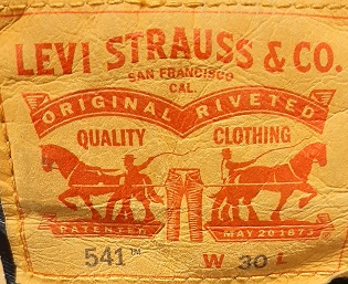
3. Levi's
Levi Strauss & Company, more commonly referred to as Levi's, is a company that started up in 1853. Levi Strauss, a German immigrant, had just moved to San Francisco from New York. His goal was to open up a second location for his brother's dry goods mercantile to serve the West Coast. Among the items Strauss sold was denim fabric. Jacob Davis, a local tailor, frequently purchased denim from Strauss, as he needed to patch tears and holes in his customers' clothing. He came to the realization that adding copper rivets to denim created a strong bond for clothing that could stand up to heavy usage and harsh conditions.
He didn't have the money to file a patent, so he teamed up with Strauss in order to obtain one. The two went into business together successfully selling denim overalls by 1857. Blue jean pants didn't come into the company's inventory until close to 30 years later. By 1892, a logo was added to their jeans and overalls which showed a pair of pants being tugged by two horses without being torn. It became so popular and well-known that many people began to refer to Levi's as "the two horse brand". While the red and white Levi's logo that most are familiar with today first appeared in 1969, many of their pants still come with a leather patch on the back of the belt area featuring the Two Horses design.
4. Sherwin-Williams
Sherwin-Williams is a very famous and highly successful company that sells paints, coatings, and floor treatment products. It was founded in Cleveland, Ohio, by Henry Sherwin in 1866. He established a business partnership with Edward Williams in 1870, and the company was officially incorporated in 1884.
Throughout its history, Sherwin-Williams has been a company that has made a lot of wise decisions, both in product innovation as well as in investments. It was able to grow rapidly through a series of corporate acquisitions during the 19th and 20th centuries. It was also a pioneer in creating ready mixed paint. Before this, consumers had to buy several ingredients to mix paint together at home. The logo of Sherwin-Williams reflects both the company's global presence as well as its home within the paint industry.
It consists of a blue and white globe, over which a can of red paint is being poured. The paint can is printed with the letters SWP for Sherwin-Williams Paints, while the writing on the paint splash hitting the globe says, "Cover the Earth". This logo has been in use for nearly 100 years, first appearing in 1926.
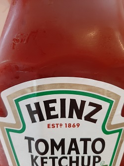
5. Heinz
In 1869, Henry J Heinz set out to make a living for himself by way of selling jars of horseradish. The horseradish was made according to his mother's personal recipe and fast became a hit in the Pittsburgh area. Heinz began selling other condiments along with it, meeting with a great deal of success. He eventually incorporated his business as the H.J. Heinz company. Its most famous product today is ketchup, though this wasn't added to the fold until 1876, at which time the company spelled it as "catsup".
Ever since 1869, the logo has included the Heinz family name. Slight design changes have been made over the years, with the current version being in place since 1957. An alternate white-on-red logo was created in 1989, though the classic logo, pictured below, is spotted on a far more frequent basis. As an interesting side note, the 57 frequently associated with Heinz doesn't actually represent the number of products the company makes. This number was added to their marketing in 1892, at which time they were already selling upwards of 60 products. Company ownership felt that 57 seemed a more lucky number and one that would stick in consumers' minds more effectively.
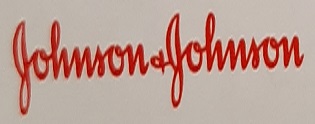
6. Johnson & Johnson
The story behind the famous red script Johnson & Johnson logo is a fairly simple one. Brothers Robert, Edward, and James Johnson had established a company that sought to save lives, protect the vulnerable, and improve the quality of healthcare. They wanted to show the world that they were firmly committed to this mission and that they stood 100% behind the quality of their products. They did so by linking them to their own family name.
The Johnson & Johnson script logo seen on products today is copied from the handwriting of James W Johnson, as it appeared on a check he signed in 1886. A slight change was made to the logo the following year, when the ampersand and second "Johnson" were added. The logo appears on many famous products and sub-brands today, including Band-Aids, Tylenol, Neutrogena, and more.
7. Prudential
The word prudential means "involving or showing care or forethought, especially in business". This is a reassuring name for an insurance company, though it is one that had to be followed through on in order for the company to be respected and survive. Prudential is an insurance company that started out in England in 1875. Its operations are within the areas of home, life, auto, and home insurance. The primary goal when the company first started out was to provide loans and affordable insurance to working class members of society. They relied heavily on the concepts of strength, honesty, and reliability.
One of the first companies to employ door-to-door sales tactics, Prudential used more than just its name to get its message across. The logo chosen by the company depicts the Rock of Gibraltar, a timeless symbol of strength and security. The Rock of Gibraltar first appeared in the company's advertising in 1860 and continues to be there to this day. Alterations have been made throughout the years, primarily involving the addition and removal of different text. The rock and company name have remained fixtures for 161 years, making it one of the most enduring logo designs in history.
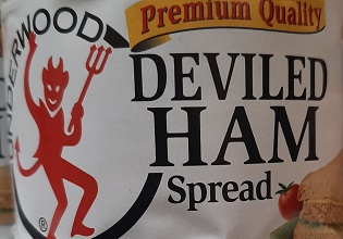
8. Underwood Deviled Ham
For those unfamiliar with the product, deviled ham is a spreadable condiment consisting of ground ham mixed with an assortment of spices. It is typically sold in cans and has a very long shelf life. While it's undoubtedly Underwood's most famous product, it wasn't their original flagship item. The William Underwood company started in Boston in 1822, selling condiments in glass jars. They soon switched to steel cans with tin coating, as these containers were more durable in addition to being speedier and cheaper to produce.
Underwood provided a great deal of canned food to Union soldiers during the Civil War, particularly seafood items. It wasn't until 1868 that the company began producing its famous deviled ham. In 1895, the famous devil design made its debut. This version looked a great deal more menacing than the updated version that came out in 1921. This version is still used today and is currently celebrating its 100th anniversary.
9. General Electric (GE)
The GE logo is one of the most iconic designs around in the world of consumer electronics. Widely known for producing top-tier light bulbs, ovens, refrigerators, dishwashers, dryers, and many other home appliances, GE got its start as Edison General Electric, named for inventor Thomas Edison. It merged with the Thomas-Houston Electric Company in the 1880s, shortening its name to General Electric.
The GE, written in script, first appeared as the company's logo in 1892. In 1900, the circle was added around the exterior to create the appearance of a medallion. Leaf-like lines were also added around the letters, which evolved into smoother and thicker swirls. Aside from these few small changes, this is a logo that has changed very little in the last 129 years. The video below depicts the GE logo as it is today, along with a lesson on how to draw it.
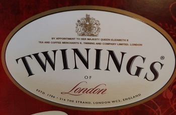
10. Twinings Tea
Twinings Tea is another company with an enduring logo design. The company started up in London in 1706, but created its iconic logo in 1787. It's the oldest logo in the world that's had fully unceasing use. Keep in mind, 1787 was 2 years before George Washington was sworn in as America's first president. The Twinings logo consists of the family name presented appearing beneath a family crest. The crest displays a shield with a golden lion and two stars, above which leaves and a hand holding two serpents can be seen. Below this, an inscription reads, "Fortiter ac Firmiter", Latin for "Strongly and Firmly".
These symbols represent strength, the Twinings family, and the company's connections to China, which was at one time the exclusive supplier of their tea leaves. One change from the original design is the removal of the two Chinese men who were once included. However, this logo still stands at the doorway of the company's original shop, which remains in operation to this day.

11. Red Cross
The American Red Cross is the only logo on this list that doesn't represent a corporation or a consumer product. The International Red Cross and Crescent is a humanitarian organization established by the Geneva Conventions in 1864. The goal of the organization is to provide relief to those in need during times of war and natural disaster. At the beginning, the very most prominent focus revolved around providing swift aid for wounded soldiers. Any person, vehicle, item, or building marked with a red cross against a white square is a clear order not to shoot or otherwise attack. This is because such entities are officially unaligned with any military and offer impartial aid.
For rather obvious reasons, it is illegal to misrepresent this design. The Red Cross and Crescent International has chapters in 192 countries across the world. Despite the Red Cross having no religious significance, there were concerns it would be perceived as a Christian symbol and could potentially alienate Muslim soldiers. As a result, the Red Crescent was created for usage during the Russo-Turkish War. The Red Crystal is officially designed to be a clearly non-denominational symbol and sees use in many regions of the world.
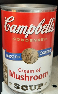
12. Campbell's Soup
The Campbell's Soup logo has been around for quite some time, making its first appearance in 1898. The original version was blue and orange, but this only lasted for one year. The red and white color scheme was inspired by the football team uniforms of Cornell University, a team of which founder Joseph Campbell was a fan.
While some say that the script displaying the Campbell's name was meant to represent the signature of Joseph Campbell, this is not the case. It was actually designed to have a quaint and domestic look that would appeal to shoppers. Also present in the Campbell's logo is a medallion. This represents an award that the company was given at the 1900 Paris World Exposition. The logo is most associated with tomato soup, thanks to Andy Warhol's famous painting. However, he actually made a separate painting all 32 flavors that were in existence at the time.
13. Coca-Cola
One of the most iconic corporate logos in America, and in the entire world for that matter, is the Coca-Cola emblem. Coca-Cola got its start in Atlanta, Georgia, in 1886. A pharmacist and businessman by the name of John Pemberton had developed an addiction to morphine as a result from injuries sustained while fighting in the Civil War.
He sought to develop a beverage that would act as a safe alternative and this is how Coca-Cola first came to be. The original recipe contained alcohol, but it was removed in response to the temperance movement. The beverage was originally sold as a syrup for users to blend together at home, but it soon began appearing pre-mixed in soda fountains. The first known commercial bottling of Coca-Cola took place in 1894.
Very little has changed about the Coca-Cola logo since its second incarnation was introduced in 1887. The very first logo was a simple printed version, though things were to change the following year. At the time, Spencerian font was very popular in advertising and in American culture in general. This is the styling that the Coca-Cola logo displays.
For a brief period from 1890-1891, a different, more pointy font was used before being quickly abandoned in favor of the original. Few changes have been made over the years, apart from the white waves that are sometimes placed below the text of the logo. Apart from this, the only notable change is the removal of the word "trademark" from the top of the first C in 1941. Alternate versions, such as the famous red disc with Coca-Cola bottle have appeared over the years and are still included on some official merchandise.
14. John Deere
The last logo we'll cover in this article is that of John Deere. Starting out in 1848 in Moline, Illinois, the John Deere company first rose to fame for their extremely popular plowing tools. The first John Deere tractor came along in 1912, 64 years after the company was established. In addition to their tractors and plows, John Deere is also world famous for its combines and other pieces of heavy agriculture machinery. The leaping deer in the company logo has had a constant presence since 1876.
It's been retooled a bit over the years, with the first version showing a deer jumping over a log, under which "Moline, Ill" was printed. Various bits and pieces were added to and removed from the text in subsequent versions, with the deer being a bit more well-defined each time through. In 1956, all text except for the "John Deere" appearing underneath the leaping deer had been permanently removed from the logo. The last tweak came in 2000, when the drawing of the deer was altered to depict it as being at the beginning of its leap instead of preparing to land.
Now you know a bit more about some of the 14 oldest and most famous company logos around the world. We hope this was a fun and informative read for you. If you'd like to engage in some more nostalgia, we recommend reading our obsolete 90s tech blog post or checking out our write-up on the scariest TV idents. We also hope that all of this talk about logos has you thinking of yours. At 4AllPromos we help to create the best logo designs for imprinting on promotional products and giveaway items to help make your brand awareness dreams a reality!


