22 Examples of Subliminal Messages in Corporate Logos

Scott Kalapos on Jan 8, 2021
For our first blog post of 2021, we'd like to start off with something fun, yet still relevant to what we do. Back in 2018, we wrote an article on the topic of how to personalize a company logo design for a promotional product. In this article, we're again talking about company logos. However, this time around, we're going to discuss logos designed by other businesses. Nearly all are large companies that you've undoubtedly heard of before and whose logos you've seen many times.
Despite having seen their logos, many on a daily basis, there are some elements you may have never never noticed before. On the other hand, perhaps you have. The 22 business logo designs we're about to share with you all have creative intricacies that often speak in some way to their corporate philosophies. Some use negative space, some use body language symbols, and others employ other methods to include their hidden messages. Have fun reading through the list below and see if you've spotted any of these subtleties before.
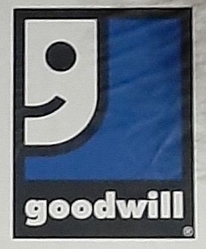
1. Goodwill
Goodwill is a charitable organization that does a lot of good deeds on a lot of different levels. Started in Boston in 1902, Goodwill Industries International (usually just called Goodwill) seeks to help people around the world. They operate several thrift stores and donation centers throughout the world, offering second-hand and occasionally new merchandise at very affordable prices. This organization also offers employment opportunities to people with disabilities who may have trouble finding work elsewhere. Their logo is quite well known, but did you ever realize that the friendly smiling face also doubles as a lowercase letter g? Take a look at the image below and you'll see that the half smiling face is shaped as it is for a reason: in addition to wishing goodwill to passersby, it also shows the first letter of the word, for a double hidden message.
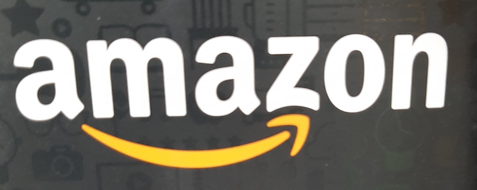
2. Amazon
Amazon is one of the most prominent retailers in the world. Though they're most famous for their online ordering system, they also have physical locations. As detailed in our previous post regarding history's most intense corporate rivalries, Amazon originally started out as a bookseller in Bellevue, Washington, in 1994. Since then, they've obviously expanded into something much larger. What might be less obvious is the cleverly veiled message delivered in their logo. At first glance, the yellowish-orange mark below the "amazon" sign may look like either an arrow or a smile. In reality, it's meant to be both. Still, there's more to note. The arrow begins below the first a and ends at the letter z. The secret message is that Amazon offers everything from A through Z. In other words, the logo's designer is you there's virtually nothing you can't find when you perform a search on Amazon.
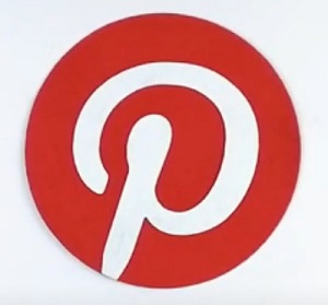
3. Pinterest Logo
Pinterest is a social media site on which users can add pictures (and less frequently, GIFs and videos) to their profiles. Users create "boards", or image groups revolving around a particular subject. They can upload and then "pin" their images to these various boards relating to different interests. Put these ideas together and it's not hard to see where the name of the company comes from. This social media site has been around since 2009 and has become a popular way to share images, recipes, and other information in a visually stimulating way. Speaking of visual stimulation, we encourage you to take a look at the Pinterest logo, located just below this paragraph. The company decided to include a fun secret message with this one. While it may be immediately observable that it contains a capital P, the letter also doubles as a map pin or thumbtack or push pin, ready to pin an item to a board. Makes sense, right?
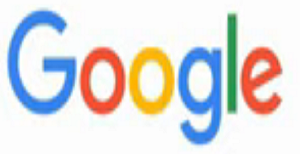
4. Google
We can pretty safely assume that every single person reading this article is aware of Google and sees its logo many times each and every day. Officially launched in 1998, Google is by far the most dominant search engine and massive IT company on the planet. It has also branched out into a variety of other products, such as cloud storage services, email services, video chat features, Android smartphones, and much more. From the beginning, Google has had a simple yet effective logo. It was designed to be easy to recognize and to be visually attractive without being overstimulating, using both color and simple white space.
Did you ever happen to notice that the l in Google's logo is green, while all of the other letters are red, yellow, or blue? This wasn't by accident. The company decided that they wanted to show they do things a bit differently and aren't afraid to play by their own rules by including one secondary color in with the other letters in primary colors. Some assert that the green l now also represents the company's dedication to eco-friendly practices.
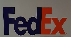
5. FedEx Logo
This year, FedEx is celebrating its 50th anniversary. The package delivery company began in 1971, based in Little Rock, Arkansas. It now operates out of Memphis, Tennessee. For its first 26 years of operation, the company was known as Federal Express. Its name was changed to the FDX Corporation in 1997, and to the current FedEx Corporation in 2000. Conducting deliveries on land and in the air, FedEx is one of the most famous delivery services in the world. Its instantly recognizable blue and red logo can be seen on trucks, planes, and drop-off boxes around the globe.
Take a closer look at the logo. Notice anything between the e and x? If you focus on the space between these two letters, you'll realize that they form an arrow pointing forward, which can connote forward direction. This is intentional, indicating the efficiency and progress toward achieving one's goals that a fast company such as FedEx offers to its customers.
6. BIC
One of the corporate logos from a non-USA based company on this list not based in America, BIC's operations are headquartered in France. The company was founded in that nation in 1945, and its official name is Société BIC S.A. They're famous for producing some of the most popular pens, lighters, and razors in the world. In fact, you'll find many custom BIC pens and promotional BIC lighters for sale at 4AllPromos. Have you ever taken a close look at the little yellow, white, and black character that serves as BIC's mascot? Created in 1961, this fellow's name is the "Ball-Headed Boy".
On close inspection, it can be seen that he's wearing an old-fashioned schoolboy uniform. The large black head portion of this logo represents BIC's ballpoint pens. The decision to make him a school-going child was intended to associate the company with school supplies and to create a character toward which children would gravitate. To drive the message home further, the Ball-Headed Boy acquired a large pen which he holds behind his back.

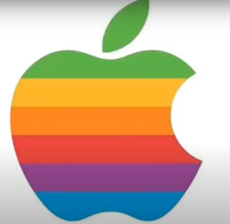
7. Apple
Apple is another company that was featured in the corporate rivalry blog post we alluded to earlier. This technology giant produces computers, smartphones, tablets, software programs, and much more analog and digital technology. Founded in California in 1976, Apple turns 45 this year. It's based in the city of Cupertino, not far from San Francisco. Throughout its history, its logo has seen changes in regard to color scheme, but the basic shape has remained the same almost since the beginning. After a brief stint with a logo referencing Sir Isaac Newton, the now-famous apple with a bite taken out logo appeared in 1977. The version we're showing is the most famous incarnation, bearing the multi-colored stripes. Though the apple has since seen silver and black versions, this is the one that's most famous.
There's been some contention as to why the Apple logo looks the way that it does and the hidden meanings it conveys. Some say that it's a play on words, involving "bite" and "byte". In reality, it was designed in the way it was to differentiate it from a cherry, which can look quite similar in silhouette form. However, there is somewhat of a subliminal message to the "rainbow stripes" version of the logo. The colorful nature was intended to remind consumers that Apple computers could work with graphics containing color. That may not sound like much to brag about now, but in 1977, this was a pretty notable achievement.
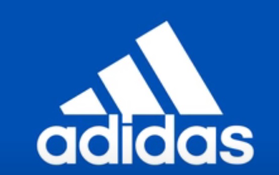
8. Adidas
Moving away from logos in the internet and tech sector, we'll now focus on Adidas. After Nike, Adidas is the world's largest producer of sportswear. Though Reebok, at least in name, is a more direct competitor to Nike, the brand is actually owned by Adidas. Adidas is a company that was started in Germany by Adolf Dassler in 1924. It has had many logos throughout the years. To this day, it continues to use different logos for different product areas. However, there is one consistent element to all of the emblems: the three stripes. These originally became part of the Adidas company as a result of Dassler seeing the design on a pair of athletic shoes produced by a company based in Finland. He liked the design so much that he bought it and made it a property of his own company.
The most frequently observed Adidas logo in the present day can be seen below this paragraph. It features the three stripes at an incline, with each stripe growing taller from left to right against the background space. This visual reference is to the metaphorical mountain of challenges that athletes must consistently climb to stay at the peak of their game and reach the boundless opportunities ahead.
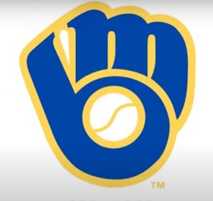
9. Milwaukee Brewers
Continuing in the sports category, we'll now talk a bit about the logo for the Milwaukee Brewers. This team started out as the Seattle Pilots in 1969. After playing in Seattle for just one season, the team was relocated to Milwaukee where it was renamed the Brewers, in reference to the local beer industry. Along with the Houston Astros, the Brewers are unique in that they've been in both the National and American leagues. Starting out in the AL, the Brewers were moved to the Central Division of the National League in 1998.
This team has changed its logo many times throughout the years, though the logo it used from 1977 through 1993 has been consistently cited as one of the best in all of sports. This logo returned in a slightly different form in 2020, owing to popular demand after a 27 year absence. Take a look at this expertly designed emblem and you'll notice several symbolic elements. The letters m and b come together to form a baseball glove, while also standing for "Milwaukee Brewers". The circle in the bottom of the lowercase b is formed by a baseball that sits in the palm of the glove. Located below is the classic 1977 version of the logo.
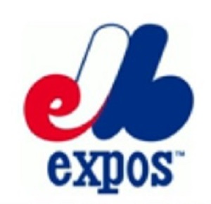
10. Montreal Expos
If we're going to talk about the all-time best baseball team logos, we surely can't leave the emblem of the now-defunct Montreal Expos out of the discussion. The Expos were Canada's first MLB team, playing in the city of Montreal from 1969 until 2004. The team's name was a reference to Expo 67, which was the name of the World's Fair. This iconic event took place in 1967, 100 years after Canada declared full independence from the UK. This name was chosen as the word "Expo" was spoken the same in both French and English, an important factor for a team located in the bilingual province of Quebec.
The team's logo was designed in red, white, and blue. This was a nod to the French heritage shared by most residents of the city. While it may have just looked like an M at first glance, the letters e and b are also included, respectively located to the left and right of the M. Together, these letters stood for "Expos de Montreal Baseball". Though the team relocated in 2004 and began play as the Washington Nationals in 2005, the logo remains wildly popular. It's still worn from time to time by the Nationals on Throwback Day. In addition, hope still remains for Montreal to acquire a new baseball team in the near future. If this happens, you can likely already guess what the team's name and logo will be.
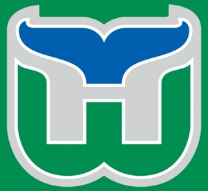
11. Hartford Whalers
This is another logo for a defunct sports team that still has a legion of loyal fans. The Hartford Whalers played in the NHL from 1979 until 1997. After the 1996-97 season, the team was relocated to Raleigh, North Carolina, as the Carolina Hurricanes. Prior to their tenure in the NHL, the Whalers were a member of the former World Hockey Association, a competing league that ceased to be in 1979. The Whalers were one of four WHA teams to join the NHL, with the others being the Edmonton Oilers, Winnipeg Jets, and the Quebec Nordiques (now the Colorado Avalanche).
The Whalers were first known as the New England Whalers, playing their home games in Boston. In 1974, the team relocated to Hartford, Connecticut. However, Hartford didn't become part of the team's name until it joined the NHL. From this, the need for a new logo came about and one of the most popular sports logos of all time was born. The W, standing for "Whalers" might be fairly obvious. However, the splash of blue at the top was meant to represent the tail of a whale. The area between the W and the tail forms an H, standing for "Hartford". The space for the H was white from 1979 through 1992, but was switched to gray for the team's last few seasons.
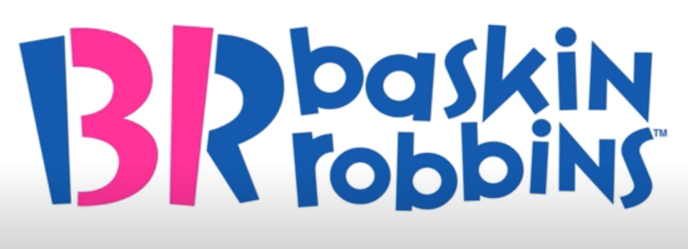
12. Baskin-Robbins
Now that we've looked at the wide world of sports, it's time to get into the emblems for some famous food-based corporations. The first one we'll share is for Baskin-Robbins. This company was founded by Burt Baskin and Irv Robbins in Glendale, California, in 1945. The original locations were in California, though they've since expanded dramatically.
Now owned by Dunkin Brands, Baskin-Robbins is a chain of ice cream & ice cream cake shops. They're famous for their assortment of 31 flavors. The idea was that a customer could come to a location every day of the month and still manage to have a different flavor of ice cream.
This ice cream flavor variety is so much a part of their identity, that a hidden reference is made to it in the company logo. The current design features a blue and pink B and R to the left of the names Baskin and Robbins. In addition to serving as the chain's initials, the B and the R also make a reference to the 31 flavors. A space divides the left and right sides of the two letters, creating a pink 3 and 1.
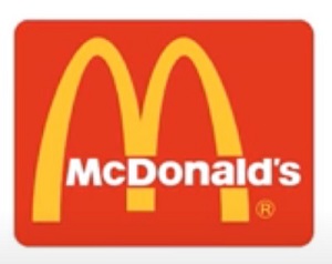
13. McDonald's
McDonald's is one of those companies that's almost synonymous with advertising. This chain has been promoted in many ways over the years and is one of the most famous corporations on the planet. Though many TV commercials, company mascots, and slogans have seen their run over the years, the golden arches have been a part of the company's identification since 1961.
In the beginning, a single golden arch served as the main support structure for restaurant signage. This was soon replaced by a set of double arches. Two were on the logo, and early restaurant locations were built with one arch on each side. At first, the arches logo featured two overlapping arches with an arrow going in between them. In 1968, the arches were joined into one unit and the arrow was dropped.
Many people might assume that the arches simply form an M for "McDonald's". While this was part of the plan, there's another subliminal and somewhat more risqué aspect to this logo. The joined arhces were actually designed to vaguely resemble a set of human breasts, creating a subliminal message of maternal safety and warmth to attract customers. Cleverly, they avoided making visual reference to this too directly.
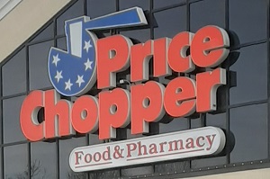
14. Price Chopper
Price Chopper may be the most obscure corporation included on this list, as its locations are only present in the states of New York, Connecticut, Massachusetts, Pennsylvania, New Hampshire, and Vermont. Still, it's a very attractive logo with some subtle components that are rather easy to miss without a close analysis. Price Chopper is a chain of supermarkets that has been around since 1932, which is why in some regions it goes by the name of Market 32.
These stores are known for their relatively large size, large in-store bakeries, and wide selection of prepared foods, some of which can rival mom's home cooking. Priding itself on offering top quality grocery items at competitive prices, the name of Price Chopper was a natural choice for this chain. When looking at the company's logo, it's not immediately clear what is represented.
The name of the store and the ax are easy enough to make out, but just what is being chopped? Though some argue it's a wheel of cheese, the circular blue item in the left corner of the logo is actually meant to be a coin. The six stars on the coin represent the six states in which Price Chopper operates.
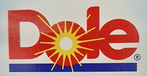
15. Dole
Dole is the oldest company with a logo contained on this list, with its origins tracing back to 1851. At this time, two missionaries to Hawaii had started up a company by the name of Castle & Cooke. This company dealt in many areas, with sugar and produce farming being part of the package. In 1901, the Hawaiian Pineapple Company was established by James Dole. Castle & Cooke established partial ownership of the Hawaiian Pineapple company in 1932, with full ownership coming to fruition during the 1960s.
By the late 1970s, other produce companies had been acquired, expanding operations. Headquarters had moved to California by this time and in 1991, the company name was changed to The Dole Food Company. The official Dole Plantation still remains in Hawaii and is a popular tourist attraction.
Dole actually went without a real logo for quite some time, opting to just add its name in capital letters to product packaging. From the late 1950s until 1986, the company logo consisted of "Dole" in red letters, with pineapple leaves extending upward from the o. In 1986, the logo was changed to the one most people are familiar with today. This consists of "Dole" in red block lettering with a bright yellow sunshine extending from the o along with a blue underline and white outline. The purpose of this new design was to remove the pineapple leaves and emphasize that Dole offers a wide variety of produce items.
This makes the logo unique among the others in this article, as Dole's emblem created symbolism by taking away an aspect of the former design rather than adding one.
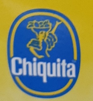
16. Chiquita
Here's another fruit-related logo to discuss and analyze. Based in Fort Lauderdale, Florida, Chiquita has been in operation since 1889. Most Americans are familiar with the Chiquita Banana advertising jingle, as well as the blue and yellow sticker that appears on most of its products. Chiquita is best known for its bananas, so it's not a surprise that they play a big role in the company's advertising.
When looking at their logo, one can observe a woman wearing a hat laden with fruit, bringing to mind Brazilian actress and dancer Carmen Miranda. What many people today don't know is that for many years, it was a banana wearing the hat instead of a woman. An even more obscure fact is that the banana in question was based on a character in a Disney cartoon from the 1940s. Since going from banana to human form, the mascot in the company logo has undergone a few style changes, but has remained largely the same since 1987. Her official name? Miss Chiquita
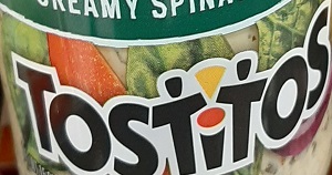
17. Tostitos
A sub-brand of Frito-Lay/PepsiCo, Tostitos tortilla chips have been around since 1979. Several different flavored and shaped chips, as well as dips and salsas have come out under the Tostitos name since. Their logo is a festive one, but with some fine details that may be missed when only looking at the big picture.
Focus a bit closer and you'll see that the lowercase t before and after the i in the "titos" part of the name represent two people. These two partiers are enthusiastically raising chips over the red dot of the lowercase i, which represents a bowl of salsa.
18. Budweiser
One of the best-known beers around the globe, Budweiser has been produced by the Anheuser-Busch company since 1876. However, its roots go back much further than that. It was based on a Czech beer by the name of Budweis which has been continuously produced since 1285. That's an astounding lifespan of 736 years and counting! Because of this, Budweiser is sold as just "Bud" in many European nations to avoid copyright issues.
Budweiser employs two different logos. One is a family crest/coat of arms style emblem. The other, which we'll focus on here, is their famous red and white design. This is actually meant to represent a bowtie. Some, but not all appearances of this logo also contain a crown within or just on top of the bowtie, a hidden message representing Budweiser's status as the "King of Beers".

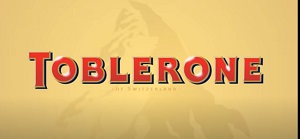
19. Toblerone
Toblerone is a deluxe chocolate bar that was invented by two Swiss business partners in the capital city of Bern in 1908. One of the two was named Theodore Tobler. It was his idea to design the candy bar in a triangular shape, mimicking that of the nearby mountains. The name of the candy bar came about as Tobler's last name being crossed with torrone, which is an Italian word for nougat. Nougat is a part of the unique recipe of a Toblerone bar, so the name made sense and has stuck ever since.
Today, the bar is produced by Mondolez International, though the logo the original company designed is still in use. The Toblerone logo features the candy bar's name displayed in front of a mountain, which is designed to look like the Matterhorn. Hidden within the artwork of the mountain is a large white bear, a symbol that also appears on the city of Bern's coat of arms.
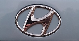
20. Hyundai
The last three logos we'll examine today are for companies within the automotive industry. The first of these is Hyundai. Hyundai is a South Korean manufacturer of automobiles, which began operations in 1967. Twenty years prior, it existed as an engineering firm. The name Hyundai means "modernity" in Korean, emphasizing a cutting edge and innovative nature to its products. Hyundai's logo may look similar to the famous Honda H, though in this case, the H stands for more than just the company name. The unique angle at with the H is placed and formed within the circular outline of the logo was designed to represent two men shaking hands. One of these men is meant to be a Hyundai employee and the other a satisfied customer.
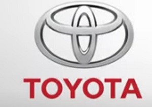
21. Toyota
Toyota is another car company with a somewhat cryptic logo. Toyota has been based in Japan since its beginnings in 1937. Today, it is the second largest auto manufacturer in terms of global sales. It's one of the most popular import brands in the USA, with a reputation for quality, longevity, and reliability. The logo Toyota presently uses came into being in 1989. It consists of three ellipses, or ovals, intersecting. Many ideas have been suggested for the meaning.
It's been said that they represent the union between the company, its products, and its customers. It has also been suggested that the outer ring represents a steering wheel, while the two inner concentric ovals form a T for "Toyota". Take a closer look at how the lines come together and it can be observed that all of the letters T, O, Y, and A are all formed within the design of the car manufacturer's logo. These are all the letters in the name Toyota.
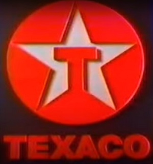
22. Texaco
We'll finish things with the logo for Texaco. Operating independently for many years under the name of the Texas Fuel Company, Texaco was the first gas station to operate in all 50 states under the same name. This has made the brand somewhat of an American icon, though that status has changed a bit in recent years. In 1999, Texaco partnered with Shell to create a company called Equilon.
Through this joint venture, the two companies shared resources and processing facilities in certain parts of the USA. When Texaco merged with the Chevron corporation in 2002, Shell bought out the rights to the rest of Equilon. As a result, several Texaco stations converted to Shell stations. Texaco, at least as a gas station, is now absent from several states in the northeastern and Mid-Atlantic regions. They've also disappeared from Kentucky and Indiana.
The company logo has remained unchanged for many years. It consists of a red circle surrounding a white star, into which a red capital T extends. The T stands for both Texas and Texaco, while the star represents the Lone Star on the flag of Texas, a reference to its days as an independent republic.
Hidden Messages in Corporate Logos
That brings our look at 22 company logos with secret messages to an end. Did you already know of these hidden meanings? Did we miss any covert symbolism with these logos or are there others you'd like to see examined? Any theories on others that have remained hidden? If so, please contact us and tell us about it! On another note, if you liked this article, we suggest taking a look at our piece on the top corporate rivalries of all time. Another article you may enjoy is our piece on the 13 scariest logos ever to appear on TV.


